As of 1.84 - there is now an empty space between the track VU meters and Plugins/inserts...looks very odd.
Is there a way to make the Tracks more similar to PT, where there are rows of inserts labeled A-D F-E etc? Essentially, three rows of track insets on each track? This was always the one thing that makes this instantly recognizable as "not" PT (although it is so far the closest theme I have seen).
For now, I am using 1.82 because of that strange empty space. Would this be possible? I would personally pay extra for this feature
Hi. thank you for the comments. I've seen in ProTools that if the track is in a folder, it creates empty space. I wanted this and the FX embed to be on the left. this current version is incomplete. anyway, I'll try a few things and give you some good news (don't extra pay)
Thanks again for this fantastic theme, is it possible to have a version of the dark theme where the item wavesforms are coloured in the unselected state and then the white shade when selected, basically the reverse of the current setting.
hi! The theme is very nice and can improve the already great reaper workflow.. just one thing: I would like to have a real phase shift button.. even if it’s hidden under Pt buttons I think it’s good to have a actual one
← Return to tool
Comments
Log in with itch.io to leave a comment.
The Theme in the 'Enable Custom Color' folder can disable the peak edge. (It will probably be updated to the default from the next update.)
As of 1.84 - there is now an empty space between the track VU meters and Plugins/inserts...looks very odd.
Is there a way to make the Tracks more similar to PT, where there are rows of inserts labeled A-D F-E etc? Essentially, three rows of track insets on each track? This was always the one thing that makes this instantly recognizable as "not" PT (although it is so far the closest theme I have seen).
For now, I am using 1.82 because of that strange empty space. Would this be possible? I would personally pay extra for this feature
Hi. thank you for the comments. I've seen in ProTools that if the track is in a folder, it creates empty space. I wanted this and the FX embed to be on the left. this current version is incomplete. anyway, I'll try a few things and give you some good news (don't extra pay)
Hi, Kajiya! Can you disable the blocking of this settings segment. Because I want to change them. Please, it's very necessary!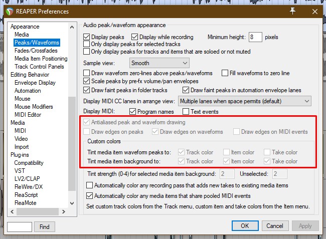
yes. I'll upload it to the request folder soon
done! it's added to "enable custom color" folder
Thank You for your support, Kajiya! I'll check it soon
When I applied the theme the colors are changed
Before: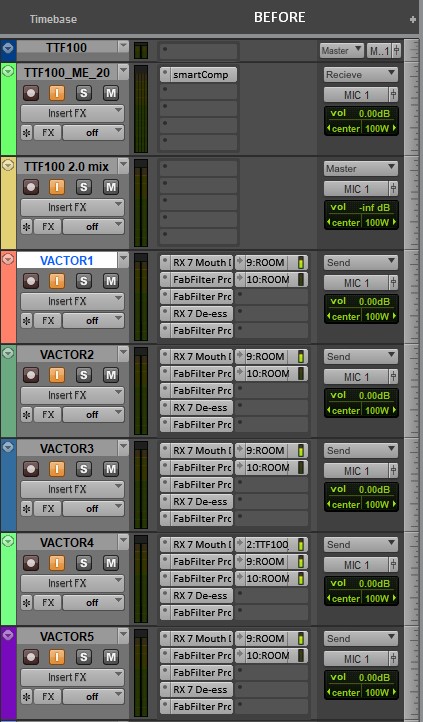
After:
Boa Noite quero adquirir o tema Mas não estou conseguindo fazer a compra pela plataforma. Alguma outra forma que eu possa comprar? Estou no Brasil
hi! what is your email?
Valmirsilvax15@hotmail.com
Hi, thanks for the update, the new dark 3 waveform colour is light instead of dark is it possible to make it dark again.
Thanks
ok!
I bought the theme and I'm really enjoying it, but I would like to know if you have a video that teaches how to enable the bar that is enabled!
Thanks
i haven't the layout c for my track panel... so i cant see my sends in tcp with a coloured interface. i'm doing something wrong?
sorry I removed that. I'll add to next update.
Thanks for the Dark 2 update, works perfectly
Cheers!
Can you please make a 125% and 150% scale version of 1080p? Thanks
only 200% version later
Hi,
Thanks again for this fantastic theme, is it possible to have a version of the dark theme where the item wavesforms are coloured in the unselected state and then the white shade when selected, basically the reverse of the current setting.
Thanks again for your work.
like this?
So the item in its normal state ( unselected ) would look like the above with item background matching the track colour and with the dark waveform
Then when item is selected then the light waveform colour.
Basically the reverse of what the theme currently does which is show a white waveform when item is unselected and the dark wavesform
when the item is selected. I don't know if the other users would find this as helpful as I would but it would be good as an option.
Thanks again.
very nice. It's different from the default settings of Pro Tools but I'll upload it in the next version so please comment how it was
Best reaper theme I've used yet and constantly being updated with improvements.
Great work!
thank you so much. this project continues as long as I live
nice work! is there chance you will make narrow mixer colour layout?
yeah, sure
hi! The theme is very nice and can improve the already great reaper workflow.. just one thing: I would like to have a real phase shift button.. even if it’s hidden under Pt buttons I think it’s good to have a actual one
ok. I'll make a new design for phase shift