I just bought the theme a while ago, it's spectacular, great work. I have seen that a colleague has solved this issue, but I do not find the option to disable these options, if you would be so kind as to tell me more precisely I would appreciate it. Many thanks
Hello! I have a nice time with your dope theme! Please make it so that you can see when shuffle, slip, grid modes are on and when they are off. Thanks!
Hello again! Using your wonderful theme I came across such a thing - because tcp folder layout has a small tab on top (exactly like in pro tools - but in pro tools pixels of distance between tracks are provided for this tab), its field of inputs does not fit completely into the zoom size similar to tcp default layout. I realize that this is more of a nag - but maybe it would be better to remove this small tab from the folder layout that all the blocks in both layouts coincide?
Hi! First of all - you did a great job! I've been using the old legacy dark clone with some tweaks from me and it's been great! But for now - i'm blown away! And special thanks for you instructions that came with ReaTools! Now i have a question. Can you remove that empty knobs and slots in Folder layout? Thanks!
hi! thanks for comment. the main toolbar is no longer supported. I got rid of unnecessary things by updating the transport buttons. if you still want it I'll add it to the update
it’s more I just was hoping that the slip and shuffle buttons and all that have a toggling colour like the original menu, if it’s within the realm of possibility. Love the theme!
Great work Sound Kayiga ! I would like to notice you a bug i have. Apparently, the fx names are not aligned to the bar. I'm on a mac. Could you give me an advice to solve it ? ?
Congratulations for this beautiful interface. Can you tell me if it is possible to put transport controls in the center? I have bought version 2.03. I have tested version 1.81 and it is fine in the center. Thank you very much for your work
I'm on MacOS Sonoma v14.1 Reaper v7.02 & Reatools v2.01. The Transport area looks different than what's you video clips. This maybe because you are on a Windows PC. I'd like to have the magnify and quick tools like yours, but this doesn't show on mine at all. Can this be corrected?
Thanks for your amazing work. What i like to see is mor fader colors for the colored MCP layout. Currently there are only red and yellow. I would love to see blue also.
a thousand thanks for your amazing work! Your theme has greatly improved my experience with REAPER.
I would be very happy if in v2.0 there would be a possibility for the peak colours to follow the colours of the track. I think in the previous versions it was possible.
Yes! i was just looking through everything to find a way to re-enable this, it would be amazing if they also got smaller depending on how many fx are used like pro-tools.
As of 1.84 - there is now an empty space between the track VU meters and Plugins/inserts...looks very odd.
Is there a way to make the Tracks more similar to PT, where there are rows of inserts labeled A-D F-E etc? Essentially, three rows of track insets on each track? This was always the one thing that makes this instantly recognizable as "not" PT (although it is so far the closest theme I have seen).
For now, I am using 1.82 because of that strange empty space. Would this be possible? I would personally pay extra for this feature
Hi. thank you for the comments. I've seen in ProTools that if the track is in a folder, it creates empty space. I wanted this and the FX embed to be on the left. this current version is incomplete. anyway, I'll try a few things and give you some good news (don't extra pay)
Thanks again for this fantastic theme, is it possible to have a version of the dark theme where the item wavesforms are coloured in the unselected state and then the white shade when selected, basically the reverse of the current setting.
hi! The theme is very nice and can improve the already great reaper workflow.. just one thing: I would like to have a real phase shift button.. even if it’s hidden under Pt buttons I think it’s good to have a actual one
← Return to tool
Comments
Log in with itch.io to leave a comment.
I just bought the theme a while ago, it's spectacular, great work. I have seen that a colleague has solved this issue, but I do not find the option to disable these options, if you would be so kind as to tell me more precisely I would appreciate it. Many thanks
It changed it was updated for simplify theme
if you enable the custom colors panel
put ';' in front of tinttcp in rtconfig like this
https://imgur.com/a/UoxoE18
Now if it works as expected.Thanks
Hello! I have a nice time with your dope theme! Please make it so that you can see when shuffle, slip, grid modes are on and when they are off. Thanks!
I also want the most. but can't make it in theme development. Reaper developer show us a miracle someday.
WALTER (on\off state for custom button) - Cockos Incorporated Forums
How can i solve this problem with the transport bar?

MacOs Ventura (13.2.1 )
thanks
hi. maybe you using on reaper6
theme is not working on reaper6. you need to upgrade to reaper7
vertical zoom action is
'View: Toggle track zoom to maximum height (limit to 100% of arrange view)'
Hello! Can you make this lines same color as track? Thanks!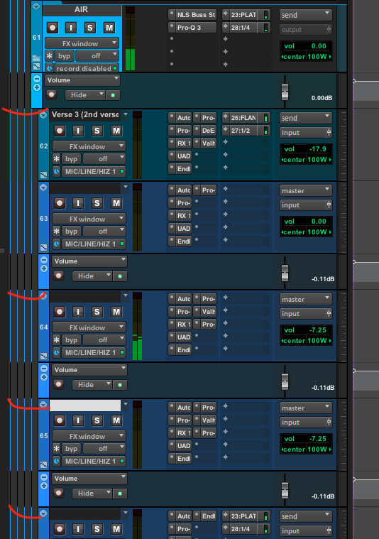
yeah this seems unnatural to me too. it will be fix maybe.
the envelope need to improve.
So I've done some finalizing of your great theme. The basic stuff:
- Made the track name, panorama and volume fonts a bit larger.
- Changed the color of the text lables on items and increased the font a bit
- Changed grid and fade lines color closer to pro tools
- Changed the appearance of the volume knob when rotating it
- Adjusted mouse modifiers and time selection color display for maximum similarity to pro tools
👍
Hi! Sorry, but I'm gonna make a couple more posts here. Why are there no files with black arrows in the cursors folder?
removed. Reaper use the cursor with set on OS cursor
Hello again! Using your wonderful theme I came across such a thing - because tcp folder layout has a small tab on top (exactly like in pro tools - but in pro tools pixels of distance between tracks are provided for this tab), its field of inputs does not fit completely into the zoom size similar to tcp default layout. I realize that this is more of a nag - but maybe it would be better to remove this small tab from the folder layout that all the blocks in both layouts coincide?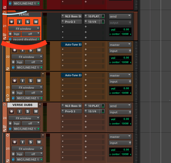
Hi! First of all - you did a great job! I've been using the old legacy dark clone with some tweaks from me and it's been great! But for now - i'm blown away! And special thanks for you instructions that came with ReaTools! Now i have a question. Can you remove that empty knobs and slots in Folder layout? Thanks!
(pro txxls folder)
hi! folder empty space is simply background and I just to make it look like pro txxls folder. so I don't intend to remove it.
two fields in Auto Layout must be left empty. my mistake
love the work you've done. This most recent update however has caused my main toolbars icons to change:
 love the work you've done. This most recent update however has caused my main toolbars icons to change:
the old (2.04):
the new (2.1):
is there something I'm doing wrong?
hi! thanks for comment. the main toolbar is no longer supported. I got rid of unnecessary things by updating the transport buttons. if you still want it I'll add it to the update
it’s more I just was hoping that the slip and shuffle buttons and all that have a toggling colour like the original menu, if it’s within the realm of possibility. Love the theme!
I just want to say that you are amazing! your work is magnificent!
You not only made the best pro tools theme ever, but you made it in my opinion better then pro tools and reaper GUIs!
It took me just a little moment to get used to it so much that I can't work with any other reaper theme anymore!
Great work Sound Kayiga ! I would like to notice you a bug i have. Apparently, the fx names are not aligned to the bar. I'm on a mac. ?
?
Could you give me an advice to solve it ?
I recently bought a Mac and I'm going to test it. thanks for bug report!
The next update is V2.1
Amazing!
I'm on MacOS Sonoma v14.1 Reaper v7.02 & Reatools v2.01. The Transport area looks different than what's you video clips. This maybe because you are on a Windows PC. I'd like to have the magnify and quick tools like yours, but this doesn't show on mine at all. Can this be corrected?
Your video:
My install on MacOS
Jd
It's removed from 2.0. I'll add it again next update
Awesome! Thanks!
Thanks for your amazing work. What i like to see is mor fader colors for the colored MCP layout. Currently there are only red and yellow. I would love to see blue also.
Dear Kajiya,
a thousand thanks for your amazing work! Your theme has greatly improved my experience with REAPER.
I would be very happy if in v2.0 there would be a possibility for the peak colours to follow the colours of the track. I think in the previous versions it was possible.
Thanks again and keep up the good work.
thank you! and I didn't touch anything about peak color. doesn't it look like this?
Hi Kajiya, my apologies, I realised it was an adaptation of mine. I set the peak colour darker in an older version.
That would be great! also how do I get that comments section to show up in the TCP the way you have in those top screen shots.
this is a JSFX but practically it's not good to use yet.
I create a new JSFX and then pasted the code
added JSFX to track input FX and enabled "Show FX embeded UI in TCP"
Attach the link for more information.
JS Notepad?
Default Input FX :Reaper
Nice update, could you do a version where we get back the multiple rows of fx inserts instead of just one row.
Thank
Yes! i was just looking through everything to find a way to re-enable this, it would be amazing if they also got smaller depending on how many fx are used like pro-tools.
:D
thanks bro ♥️ for adding and solo and mute button 😇
Don't work with 1.86 the custom color Is not avaible
no longer support sorry
I'll update that from the next update
New update looks goooood
The Theme in the 'Enable Custom Color' folder can disable the peak edge. (It will probably be updated to the default from the next update.)
As of 1.84 - there is now an empty space between the track VU meters and Plugins/inserts...looks very odd.
Is there a way to make the Tracks more similar to PT, where there are rows of inserts labeled A-D F-E etc? Essentially, three rows of track insets on each track? This was always the one thing that makes this instantly recognizable as "not" PT (although it is so far the closest theme I have seen).
For now, I am using 1.82 because of that strange empty space. Would this be possible? I would personally pay extra for this feature
Hi. thank you for the comments. I've seen in ProTools that if the track is in a folder, it creates empty space. I wanted this and the FX embed to be on the left. this current version is incomplete. anyway, I'll try a few things and give you some good news (don't extra pay)
Hi, Kajiya! Can you disable the blocking of this settings segment. Because I want to change them. Please, it's very necessary!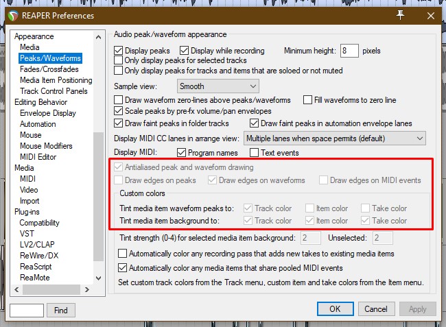
yes. I'll upload it to the request folder soon
done! it's added to "enable custom color" folder
Thank You for your support, Kajiya! I'll check it soon
When I applied the theme the colors are changed
Before: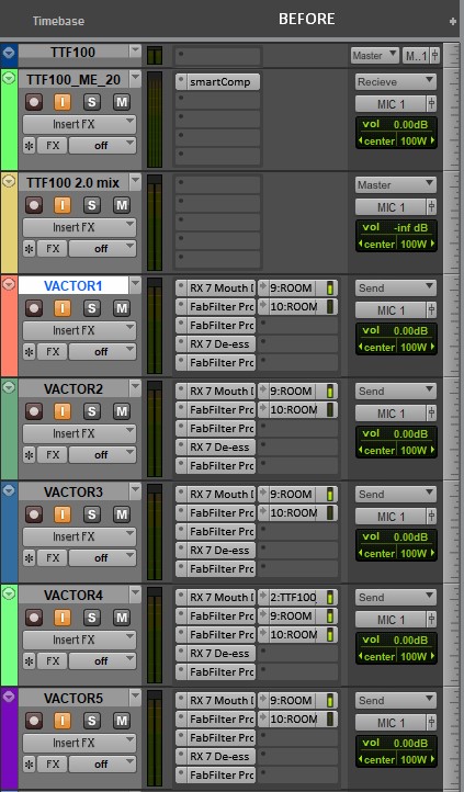
After:
Boa Noite quero adquirir o tema Mas não estou conseguindo fazer a compra pela plataforma. Alguma outra forma que eu possa comprar? Estou no Brasil
hi! what is your email?
Valmirsilvax15@hotmail.com
Hi, thanks for the update, the new dark 3 waveform colour is light instead of dark is it possible to make it dark again.
Thanks
ok!
I bought the theme and I'm really enjoying it, but I would like to know if you have a video that teaches how to enable the bar that is enabled!
Thanks
i haven't the layout c for my track panel... so i cant see my sends in tcp with a coloured interface. i'm doing something wrong?
sorry I removed that. I'll add to next update.
Thanks for the Dark 2 update, works perfectly
Cheers!
Can you please make a 125% and 150% scale version of 1080p? Thanks
only 200% version later
Hi,
Thanks again for this fantastic theme, is it possible to have a version of the dark theme where the item wavesforms are coloured in the unselected state and then the white shade when selected, basically the reverse of the current setting.
Thanks again for your work.
like this?
So the item in its normal state ( unselected ) would look like the above with item background matching the track colour and with the dark waveform
Then when item is selected then the light waveform colour.
Basically the reverse of what the theme currently does which is show a white waveform when item is unselected and the dark wavesform
when the item is selected. I don't know if the other users would find this as helpful as I would but it would be good as an option.
Thanks again.
very nice. It's different from the default settings of Pro Tools but I'll upload it in the next version so please comment how it was
Best reaper theme I've used yet and constantly being updated with improvements.
Great work!
thank you so much. this project continues as long as I live
nice work! is there chance you will make narrow mixer colour layout?
yeah, sure
hi! The theme is very nice and can improve the already great reaper workflow.. just one thing: I would like to have a real phase shift button.. even if it’s hidden under Pt buttons I think it’s good to have a actual one
ok. I'll make a new design for phase shift